Artisand operates within the hardscape supply space—providing materials for driveways, patios, and outdoor living environments. The opportunity was to reposition the brand beyond a standard supplier into a more elevated, design-conscious presence. Ulysses Creative Studio developed a visual system that reflects precision, craftsmanship, and architectural thinking—aligning the brand with the quality of the spaces it helps create.
The mark is built from a geometric configuration inspired by interlocking pavers. Rather than depicting materials literally, the symbol abstracts the idea of assembly and structure into a clean, modular form.
The square container reinforces stability and order, while the internal lines suggest connection, repetition, and craftsmanship—core principles of hardscape construction. The result is a mark that feels architectural and systematic, directly reflecting how materials are laid and composed in real applications.
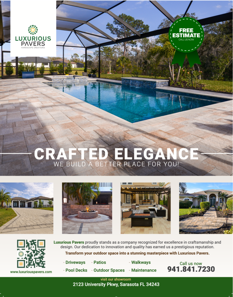
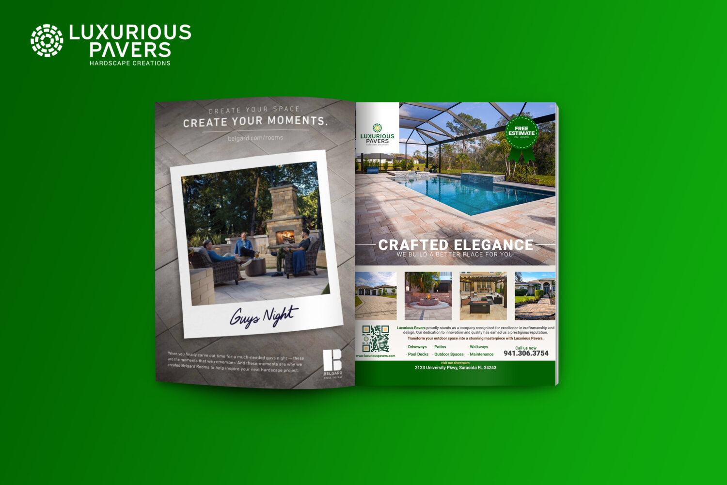
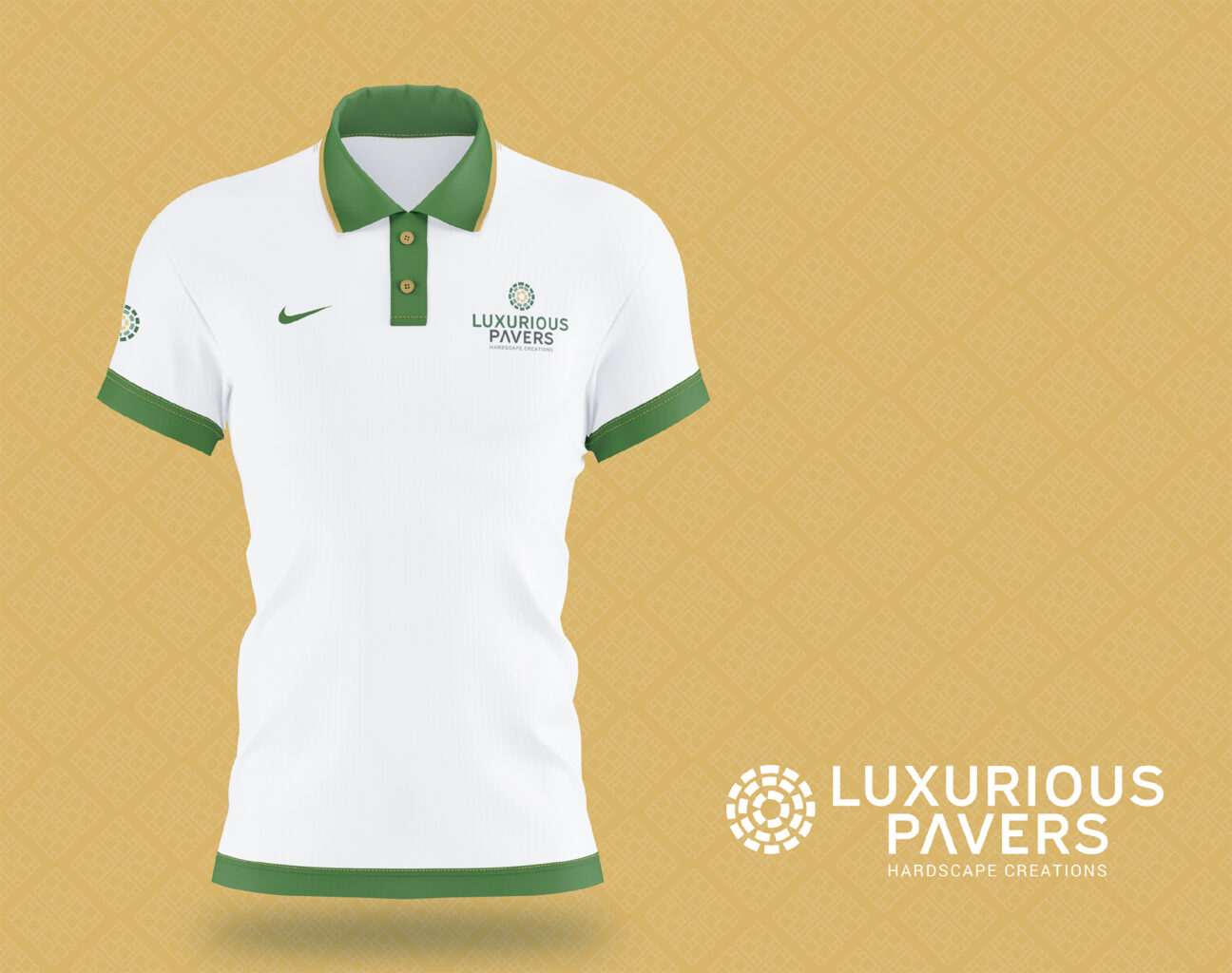
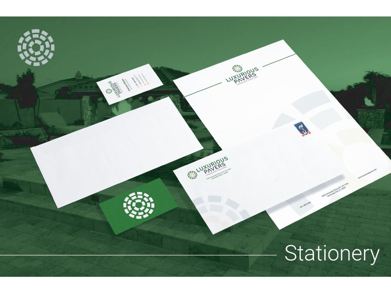
Each application was designed to maintain consistency while adapting to its context—combining bold layouts, refined typography, and a disciplined color palette to ensure strong visibility and recognition. The result is a cohesive brand presence that performs seamlessly across print and on-the-move touchpoints, reinforcing professionalism at every scale.